Posts

Mosaics

Image
For a period of at least fifteen years, I spent two weeks of each summer in Italy. During that time I made a point of seeing all the art and architecture which interested me. The one famed centre I didn’t visit was Ravenna. I had not been impressed by the reproductions I had seen of the mosaics there. But this year, I did visit the city. Undeniably, there is a certain magnificence to the churches and other buildings that house the famous mosaics, but seeing them in actuality has not substantially changed my opinion. If I were to choose my most memorable passage, it would be the ‘three kings’ section in  S. Apollinare. Balthazar, Melchior and Gaspar prance forward with their gifts, in decorative tights that would not disgrace the trendiest of fashion magazines and their side-on posture is a welcome relief from full-frontal saints and dignitaries. But seeing them was not an experience like first seeing works by Massacio, Mantegna, Piero della Francesca, Alberti, Giotto, or Borom

Pritt Stick Madness

Image
Above is a photograph of a double page from the first of the scrapbooks that form my Museum without Walls. It shows why I am already on my second. If I had placed the large Picasso reproduction further to the left, I would have room for the two smaller pieces by the same artist alongside. Thus there would be space for the Van Gogh from the opposite page underneath. That would have been an improvement; the purposes of my collection are not undermined by compactness. As a practising artist, I am always judging or appreciating when looking at art. I am not particularly fond of the Picassos. They are there with many others in my scrapbook because of the ongoing debate inaugurated by John Berger in his book Success and Failure of Picasso about the quality of the artist's post- Guernica work. The Van Gogh is of interest because I do enjoy looking at it, and I have the cutting because of a misjudgement. Several years ago, when visiting the Van Gogh Museum in Amsterdam, I

In defence of Bonnard

Image
The Sunday Times art critic Waldemar Januszczak has taken recently to rubbishing some of the big figures of 20th-century art. Henry Moore, Leger and now Bonnard have received the treatment. And he is not above using scatology to signal his contempt: he has referred to Moore’s ‘turds’ and asks ‘what is that shit-brown rectangle?’ in one of Bonnard’s paintings. Picasso apparently dismissed Bonnard’s work as ‘a pot-pourri of indecision’, and that gives Januszczak confidence in his judgment. He seems to think that Bonnard had no idea of which colour to use and squeezed out blobs at random, before dotting them over his canvases, and that his reputation as a great colourist is a myth. It doesn’t occur to the journalist-critic that this building-up with small brush strokes is leading to a finished product of deliberate intention. The technique is not dissimilar to that used by Cezanne with a very different intention and outcome. I haven’t actually seen the Tate exhibition which Januszcz

The demise of the art reproduction

So the Turner Prize has been won by a video produced by an artist entirely on her mobile phone. It’s not good news for the concept of ‘the museum without walls’, Malreaux’s phrase which he coined to promote visual art  by the publication of illustrated books, in his case of French painters. And it certainly isn’t good news for my scrapbook where  I Pritt Stick in reproductions from newspapers and magazines to enjoy and judge. Reproductions have spread  ideas in art since the invention of engraving. Even tapestries, which were sometimes multiples, could have that effect. Raphael had a profound influence from the compositions in his superb tapestry cartoons. On a personal note, I remember being given the task at school to design a record cover. I chose to do one for the honky-tonk pianist Winifred Atwell’s number, ‘The Poor People of Paris’, in a style heavily influenced by Picasso’s Blue Period which I had seen in one of the earliest cheap art books from the Fontana series. I had

The best of Banksy?

Image
I am not a fan of stunt art, but I do have one tiny example of the work of Banksy in my scrapbook. It too is a stunt piece, but of a different kind from the paintings that appear overnight on sundry wall or the ‘Girl with a Balloon’ that was gradually destroyed after being bought for a huge sum at auction, giving a different meaning to the auctioneer’s words, “going, going, gone”. The work I have pasted in is a reproduction of a piece of stone with a figure pushing a supermarket trolley in imitation of the style of prehistoric cave painting. It was positioned in the British Museum and was apparently unobtrusive for several days before it was discovered. I have had plenty of occasions when I could have cut out reproductions of Banksy’s work from newspapers but never felt inclined to do so. Why would I want to preserve images in a very commercial art style?  But I find the trolley-pusher more pleasing. It is untainted by the obscene prices of the current art market,

Found art

Image
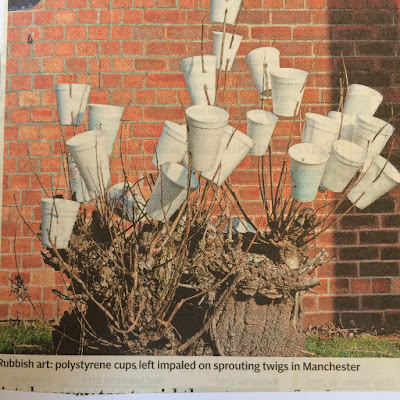
An oddity that I've pasted into my book from some newspaper or other is a photograph of a tree stump with sprouting twigs on which polystyrene cups have been impaled. I have some doubt that this piece, which works rather well, was just arrived at by a group of people finding a convenient way of disposing of the containers of a quick coffee. Each cup is attached in the same way with two piercings, which must have taken a bit of application. It is titled 'Rubbish art' and reminds me of the witty sculptures by Tony Cragg, in which pieces of furniture have been covered all over with cup hooks or screw-in wooden knobs. But while the coffee tree may be a careful contrivance rather an accidental artwork, perhaps there is such a thing as found art. In a morning walk over Calton Hill and round some of the swanky terraces of Playfair's New Town, I came across this image of a duck. This is a piece of accidental vandal art, formed from one of a number of sandbags tha

Definitely Visual

Image
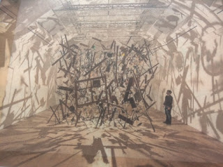
Cornelia Parker in her appearance on BBC 4's series Great Lives , chose Marcel Duchamp. Throughout the programme she emphasised the artist's opposition to 'the retinal', which I take to mean that he wanted to appeal to the mind rather than the eye, conceptually rather than visually. I have in my scrapbook a photograph of Parker's famous work which involved the blowing-up of a garden shed. It was made into an installation by somehow suspending the wooden fragments and lighting them within an enclosed space, so that shadows are cast on walls, ceiling and floor. It seems to me that the result is definitely visual. And wonderfully so.  Looking at the careful arrangements of the elements of the shattered hut, with the placement of the intact window frame and the various planks standing out from an overall texture of small fragments, I would go so far as to say, that it is a triumph of calculated composition over aleatory effect. It is not the explosion that gives